Bintel Maps Series - Colorado Oil Visualized
Whether you’re interested in building or using maps, this data when mapped is wild.
This past week we released our beta Bintel Maps application and to mark the occasion I wanted to show you a map that really blew my mind. I already understood the data and had a vague understanding of what was going on in the DJ Basin but seeing it…
The cool thing about our Bintel Maps is how easy it is to explore a question you have, find the data and visualize it. In particular, I’m fascinated with the technology and infrastructure that’s all around us. It powers our daily lives but fades into the landscape. Roads, utilities, transportation, mining, pipelines, native animals, waterways, historical sites, parks, trails, public safety and telecommunications. And in the West, oil and gas.
I decided to see what I could find on oil production in Colorado. I was also taking our new Bintel Map product for a spin and hoping the data would be available. It was and it was astounding. I’ll show the steps I took to build these maps (I posted it on LinkedIn last week) and the data that created it. But first, some facts on Colorado oil.
What role does Colorado play in US Oil Production?
Keep in mind the US produced and consumed record amounts of oil last year. According to Statista, in 2022 Colorado ranked as the 5th largest state producer of crude oil with 157 million barrels.
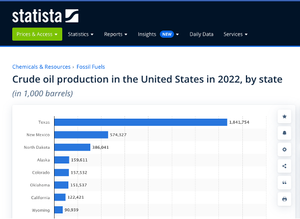
While Colorado production is significant, it’s ranked number five and is less than 10% of #1 Texas.
Where does it all come from?
From the ground obviously but I wanted a 3D view, not just what’s visible on the surface. Since I travel on E-470 frequently out towards the airport, I chose that area to focus on. For mapping purposes, I found the public data I was looking for on the Colorado Energy and Carbon Management Commission (ECMC) site. This site has a ton of data so I plan to come back.
I visualized the data as shown below for three layers from the GIS shape files on the site.
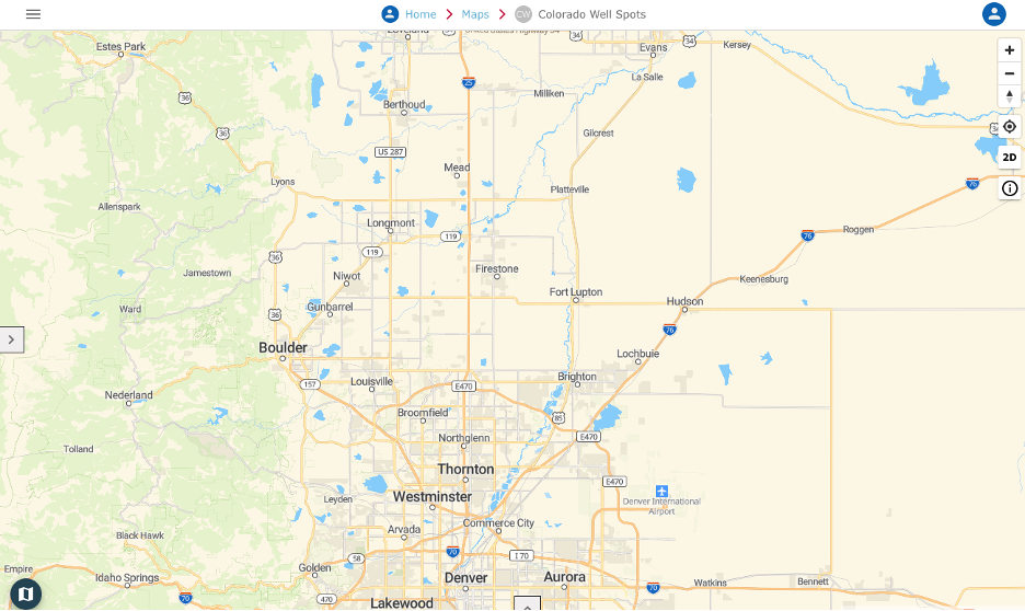
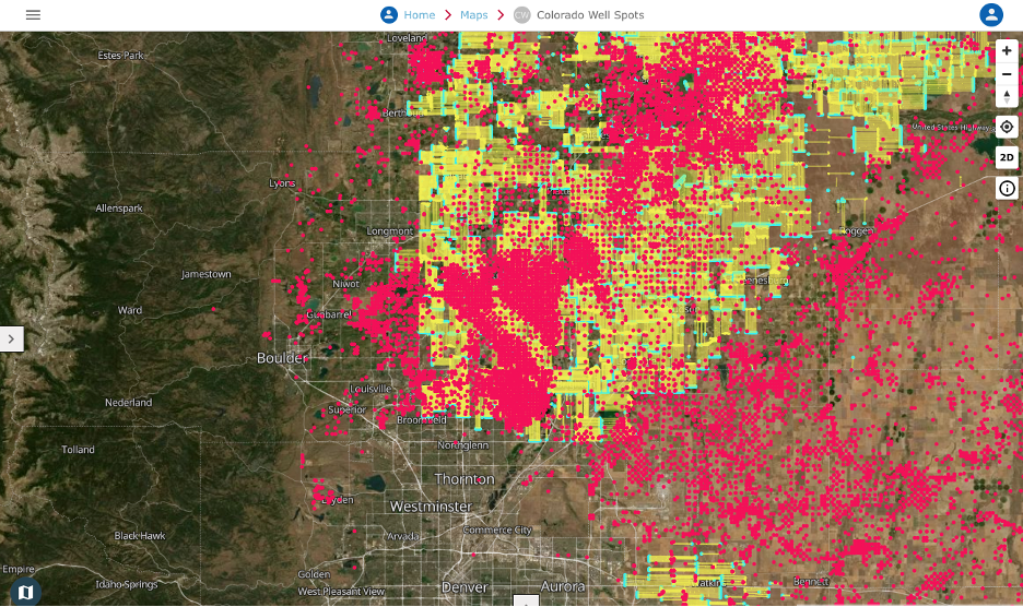
First rule of good data visualizations is to set context, so to create perspective and help you locate yourself on the maps, I started with a conventional street map of the north Denver area. The base layers below are the same area but later zoomed in to the area at the intersection of E-470 and I-25.
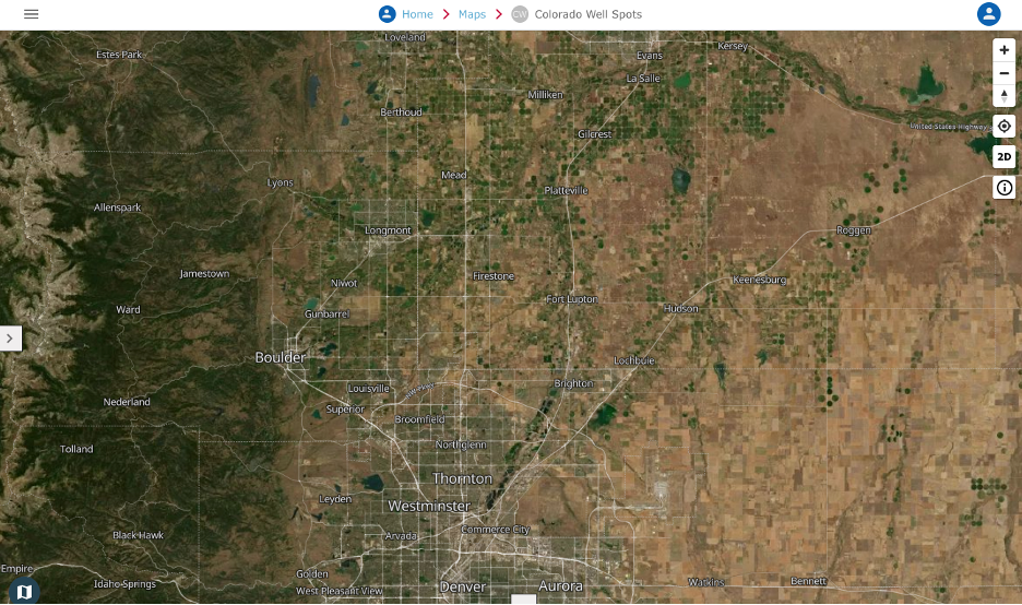
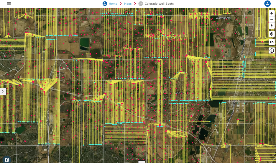
This second image below is the same view with satellite imagery. This is a personal preference when I’m trying to make good looking maps with a sense for the terrain and vegetation, etc.
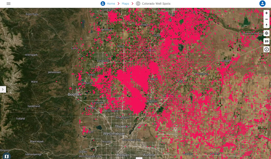
Now for some data. The first layer of data shown below is all the Well Spots that have been drilled, some very old and long ago inactive and some just recently completed. That was a pretty dramatic change as from this height it looks like there is nothing but wells down there. When driving across the area it just doesn’t give you the sense there are so many wells.
Before zooming in I added two more data layers. The yellow are Well Directional Lines that start on the surface, run down to approximately 12,000 ft below surface then horizontally for varying distances. The Directional Lines terminate at the Well Bottomhole which marked as a blue dot.
Since the data from this height is hard to understand, I zoomed in to an area just north of Denver at the intersection of E-470 and I-25. This image provides a much better view of the surface landscape and the oil production infrastructure below.
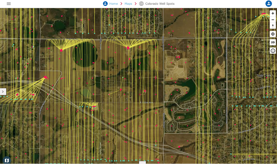
Zooming still further into the image below, you can really see how far the lines extend and the newer well pads that handle many wells, thereby reducing the infrastructure we see on the surface. Now when I see one of these new well pads, I’m wondering how many people realize what’s under their backyard two miles down.
We plan to continue this series with the help of our users. You don’t have to be a specially trained GIS professional with expensive software. You can find interesting public data sets, bring them to life and share them so we better understand the infrastructure around us.
If you have some ideas you’d like to see mapped or better yet, would love to build your own, please follow us and try out Bintel Maps.